Supercharging a brand, sustainably.

Assent is a software company specializing in supply chain sustainability management solutions that help manufacturers manage business risk by tracking ESG priorities such as human trafficking, modern slavery, toxic substances, conflict minerals and corruption, while providing expert guidance toward best practices.
The company had been a trailblazer in the space for about 10+ years, but the growth of Assent Compliance (as it was known pre-rebrand) had outpaced the brand and there was both strategic and visual misalignment with the ambitious growth goals of the company. Visuals and messaging were also muddled internally, causing headaches for executive leadership as well as in-house creative, content, and recruiting teams.
In early 2020, Assent partnered with Brand Evident to realign brand strategy, redefine their category, and create a centralized brand narrative. I was brought onboard during this process to lead the development of an all-new brand identity system.
Despite the brand disarray, I found a remarkably consistent perception of the company during the research phase. The terms depth, expertise, trust, and quiet confidence were cited repeatedly when I asked people what core Assent attributes needed to be amplified. And bringing those qualities forward was critical as Assent’s new positioning was being built out to bridge their traditional technical buying audience with a new focus on C-level decision makers.
A Symbol of Change
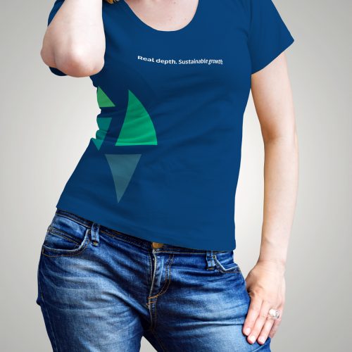
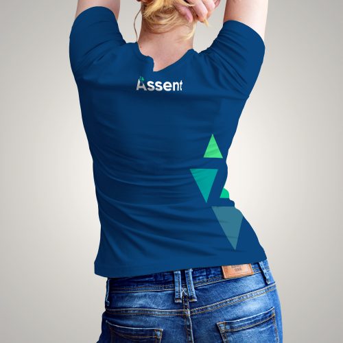
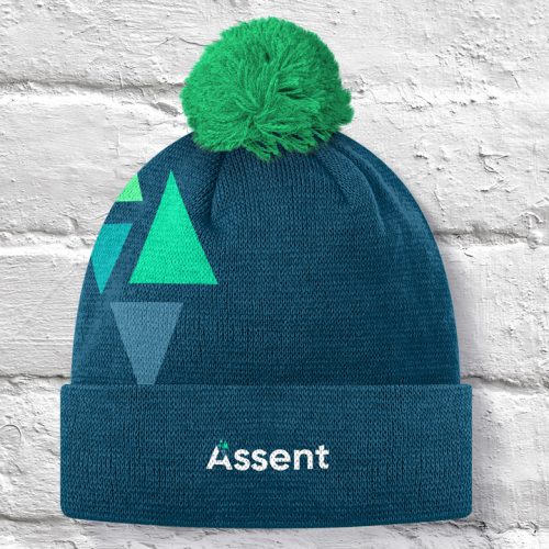
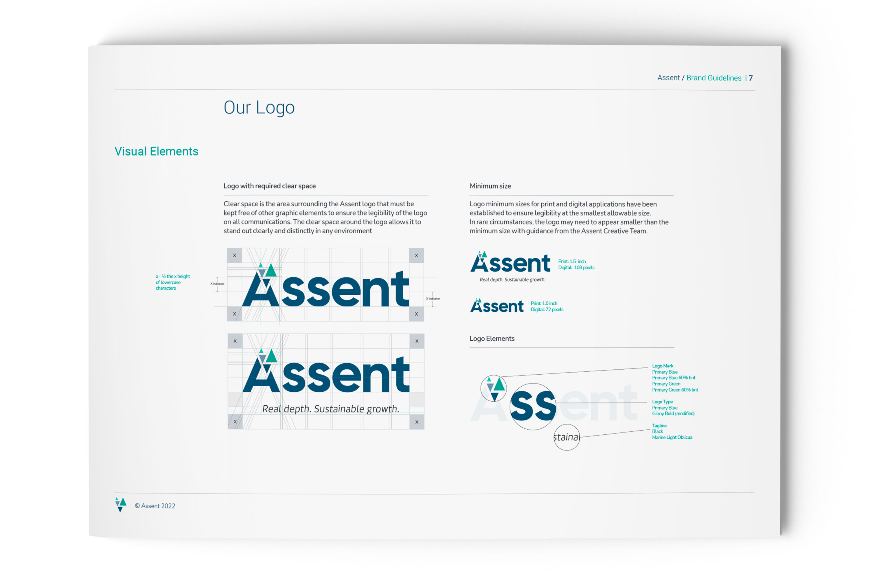
The triangle is the scientific symbol of change but also represents balance, guidance, and strength. The shapes assemble like parts in a customer’s manufacturing process and point both up and down to reinforce the brand pillars of growth and depth, echoing the shape of the capital “A”.
The Confident Type
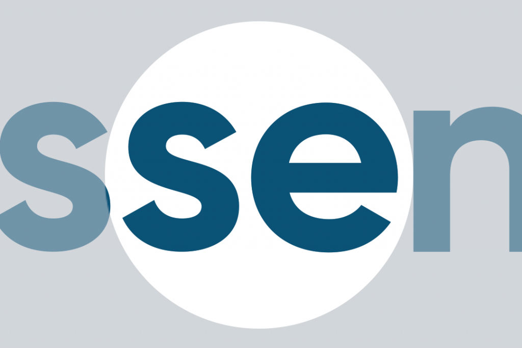
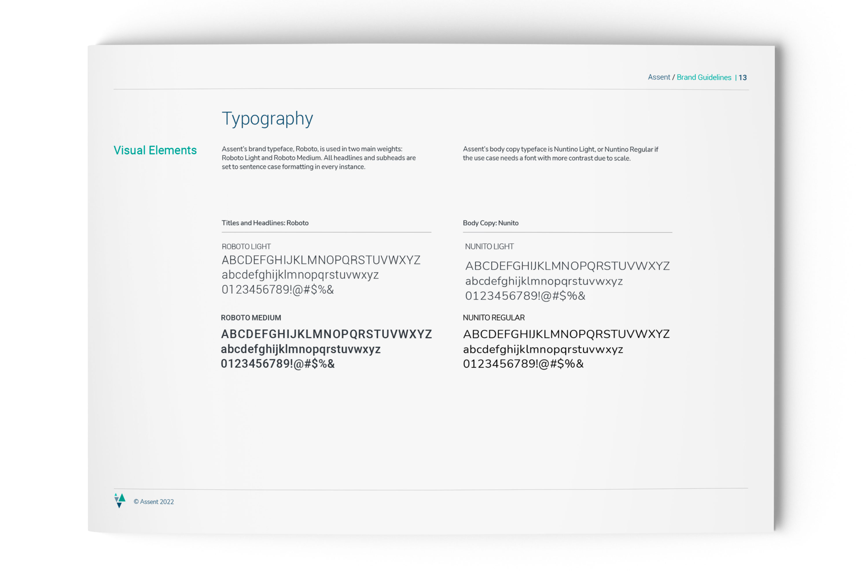
The logotype was engineered to be approachable, friendly, and straightforward while carrying a reassuring and quiet confidence. The brand fonts were selected to reinforce those attributes with Roboto emphasizing trust and stability, and Nunito connecting on a human-to-human level.

Tones of Trust
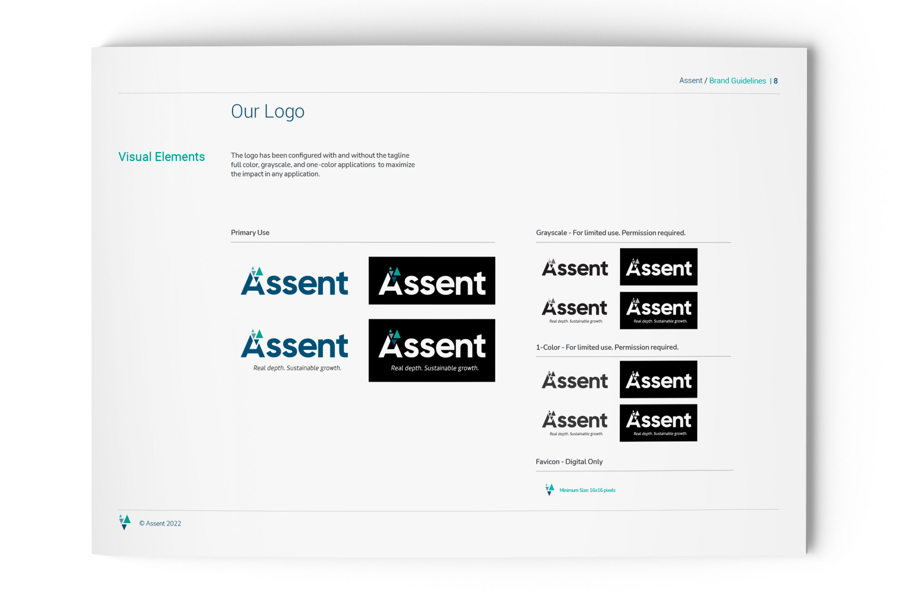
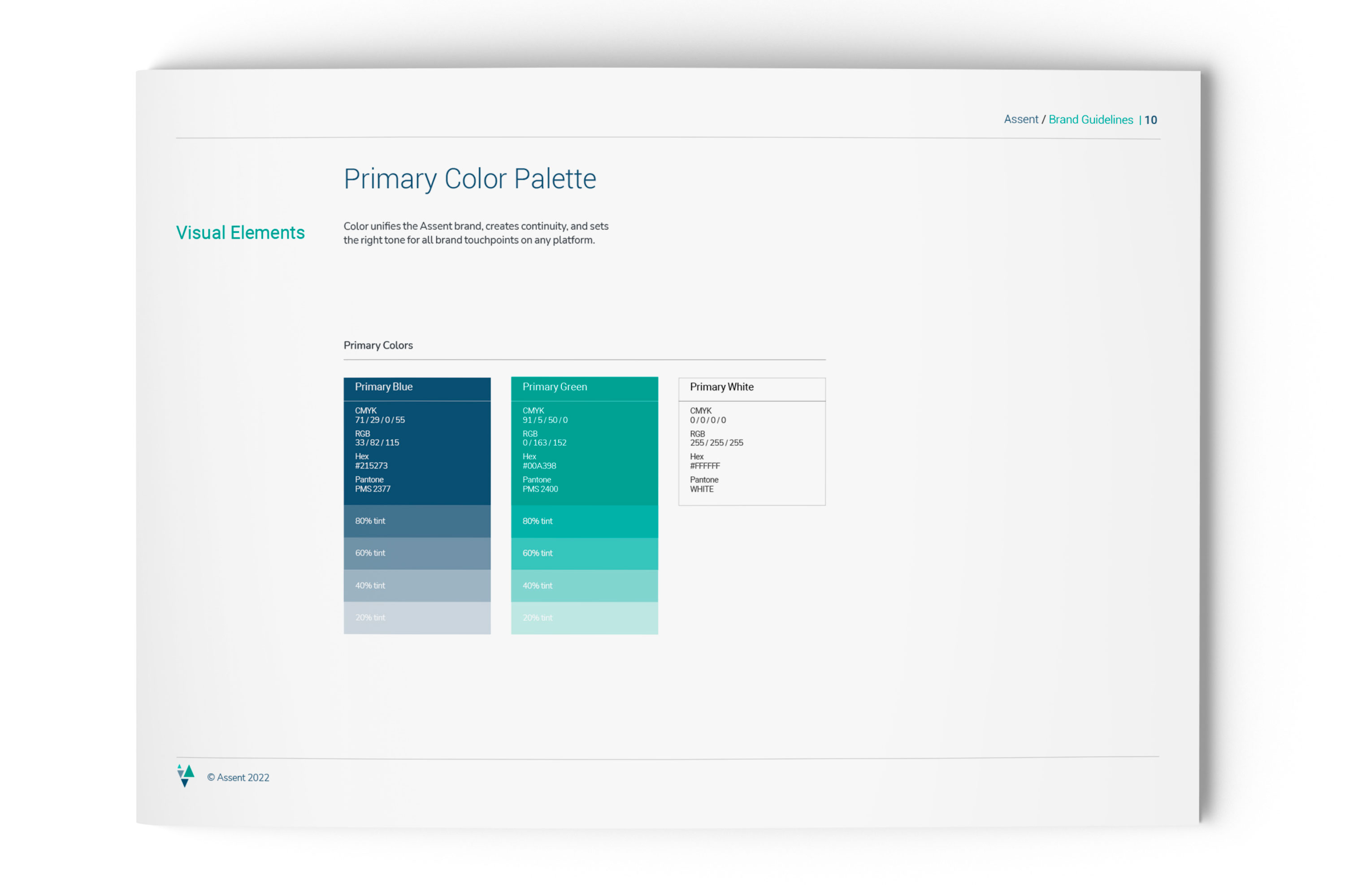
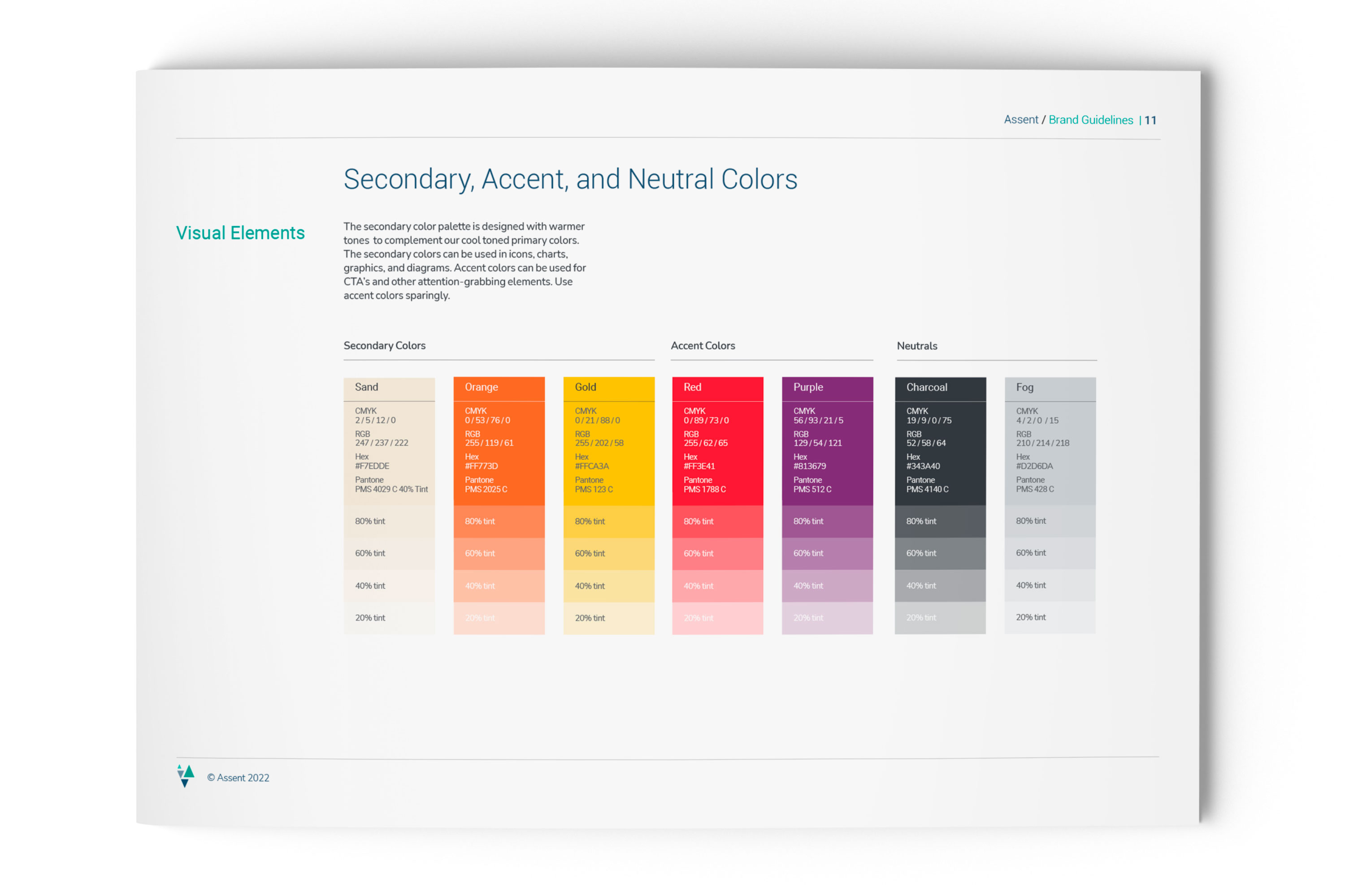
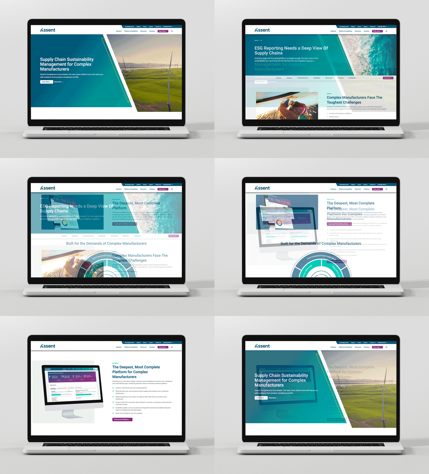
The cool tones of blue and green dominate the brand colors to bring forward feelings of trust, protection, sustainability, and constant renewal. A suite of warmer secondary colors was developed for additional brand expressions.

Photography for Business Impact and Social Outcomes
Customer outcomes are represented with macro photography themes of many parts becoming one, or a pattern that is continually repeated with ease and efficiency. Social themes also use patterns and repetition to evoke the organic growth and progress that occurs when an organization has sustainability driving its business plan. Human-focused photography accentuates positive outcomes to tough global/social problems in an ideal future state, imbuing the brand visual with forward-looking optimism.

Services Provided
- Brand Strategy
- Creative Direction
- Visual Identity
- Brand Guidelines
- Brand Visual Platform
- Brand Training
- Copy Editing
- Video Script Collaboration
- Video Production
Creative Collaborators
Brand Evident
Cultivator Content Labs
BlueText
Michelle Jones
Jessica Moore
