












ASSENT

Making Depth Visible

Assent’s reputation was stronger than its brand. The job was to close that gap.

Assent is a software company specializing in supply chain sustainability management solutions that help manufacturers manage business risk by tracking ESG priorities such as human trafficking, modern slavery, toxic substances, conflict minerals and corruption, while providing expert guidance toward best practices.

Challenge

Growth Outran the Brand

Assent had spent a decade leading supply chain sustainability, but its growth had outpaced its identity. Visuals and messaging were muddled internally, creating headaches for leadership, creative, content, and recruiting teams alike. And the company’s new positioning asked the brand to reach a new audience, C-level decision makers, without losing the technical buyers who built the business.

Insight

The Brand Didn’t Need New Attributes. It Needed to Stop Hiding the Real Ones.

The new positioning set the direction, but it needed proof people could feel. When I asked people inside Assent what to amplify, the answers were strikingly consistent: depth, expertise, trust, and quiet confidence. Those qualities bridged both audiences, since engineers trust depth and executives trust confidence. The brand didn’t need a new personality. It needed to show the one it had.

Answer

An Identity Built on What People Already Believed

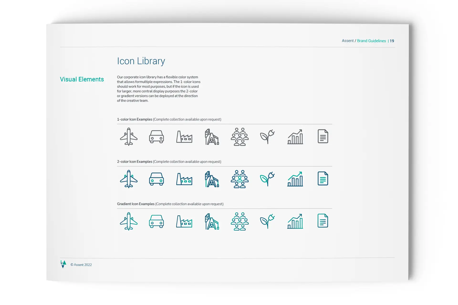
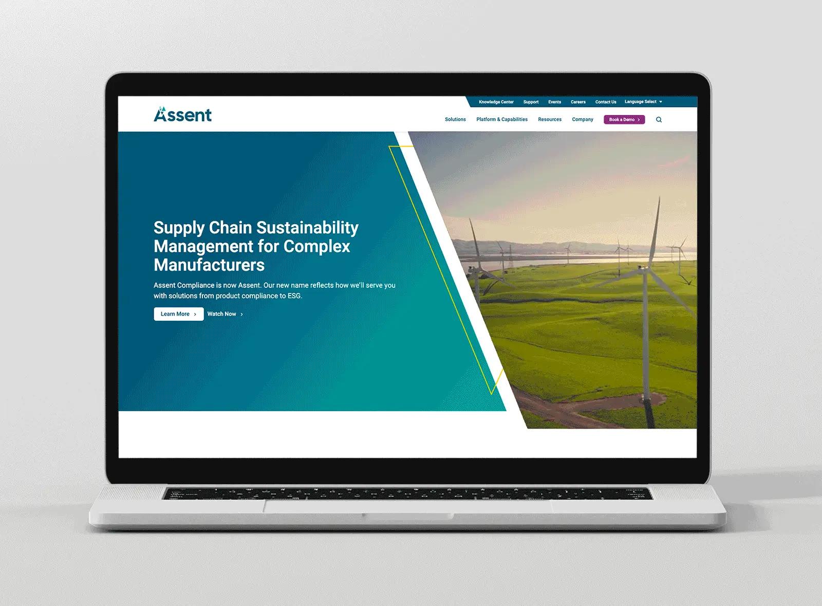
Brand Evident had completed Assent’s repositioning. I was brought in to turn that strategy into a brand: identity, visual system, guidelines, and the training to make it stick.

A Symbol of Change

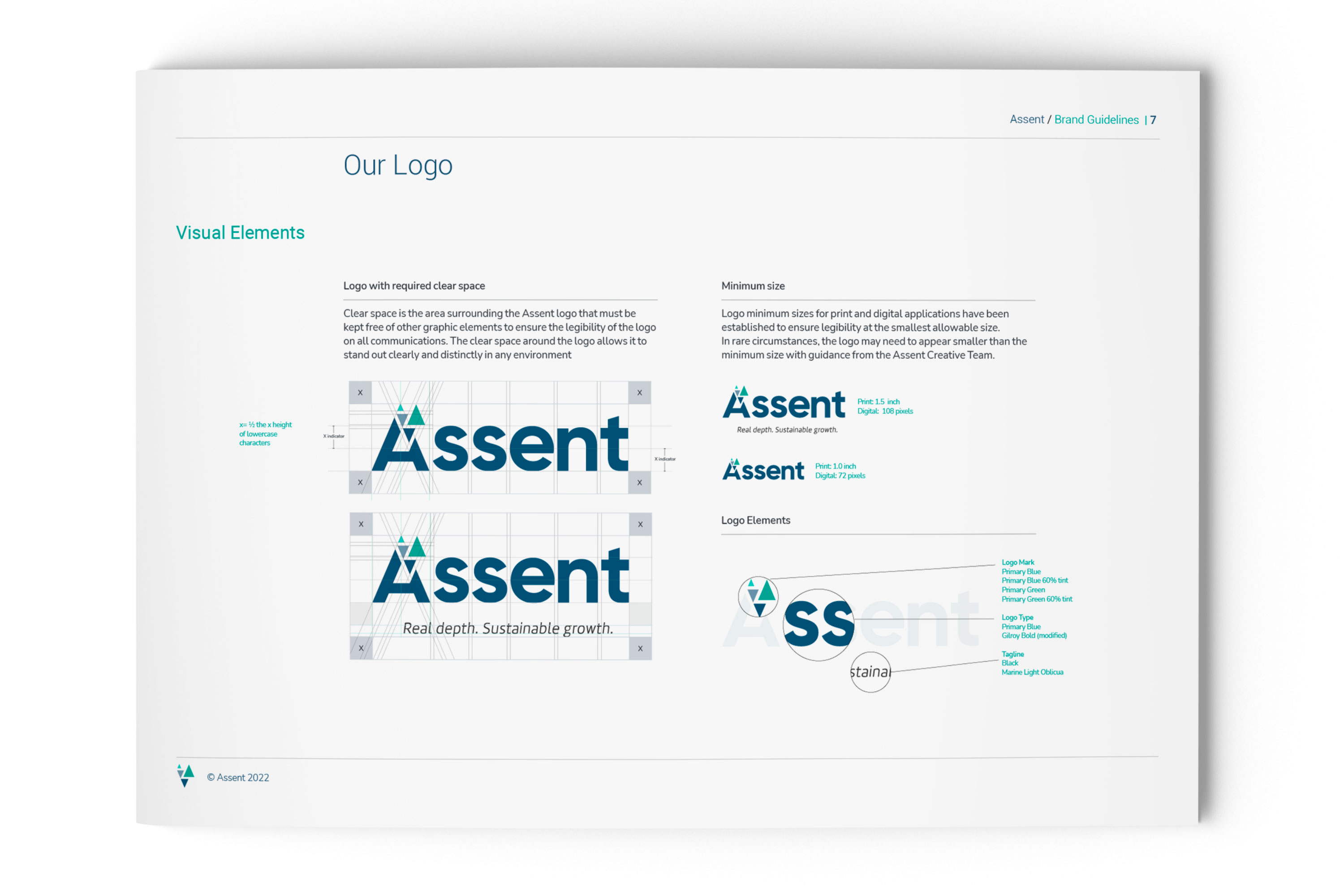
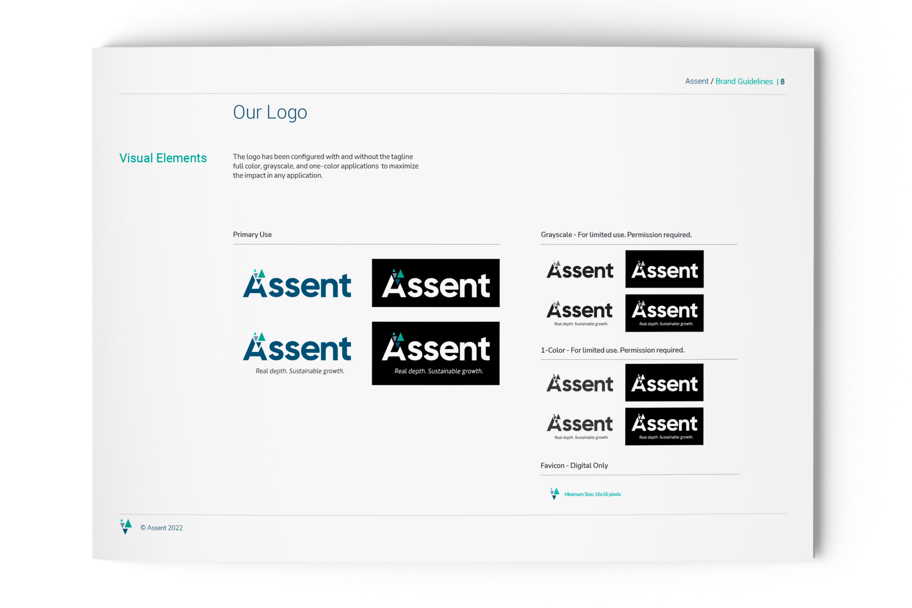
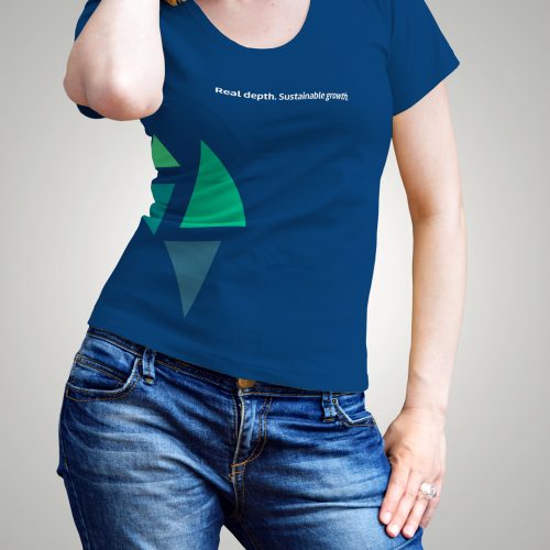
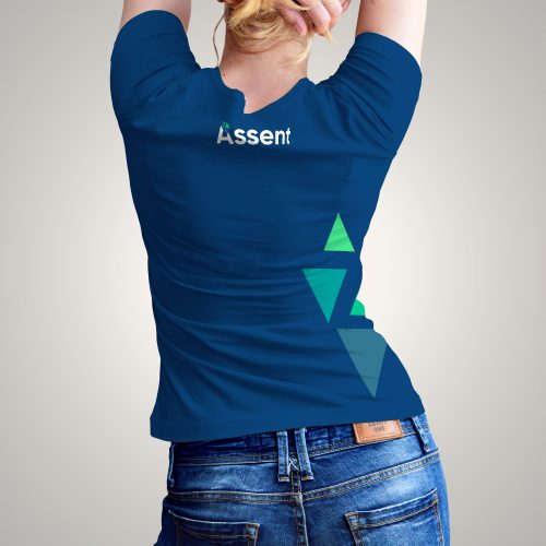
The triangle, the scientific symbol of change, points up and down for growth and depth, and echoes the capital A.

The Confident Type

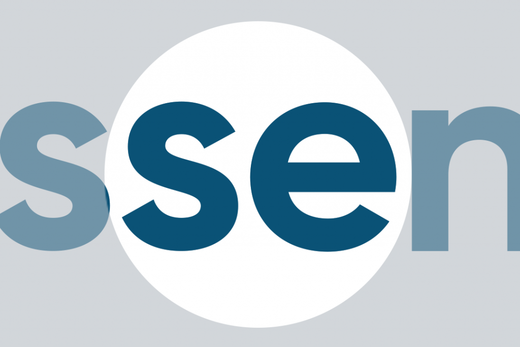
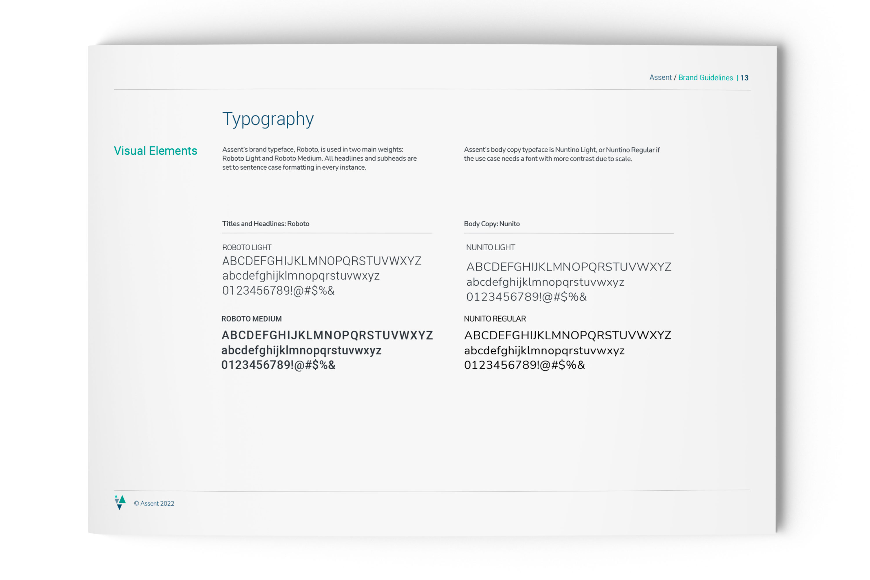
The logotype was engineered to be approachable, friendly, and straightforward while carrying a reassuring and quiet confidence. 

Tones of Trust

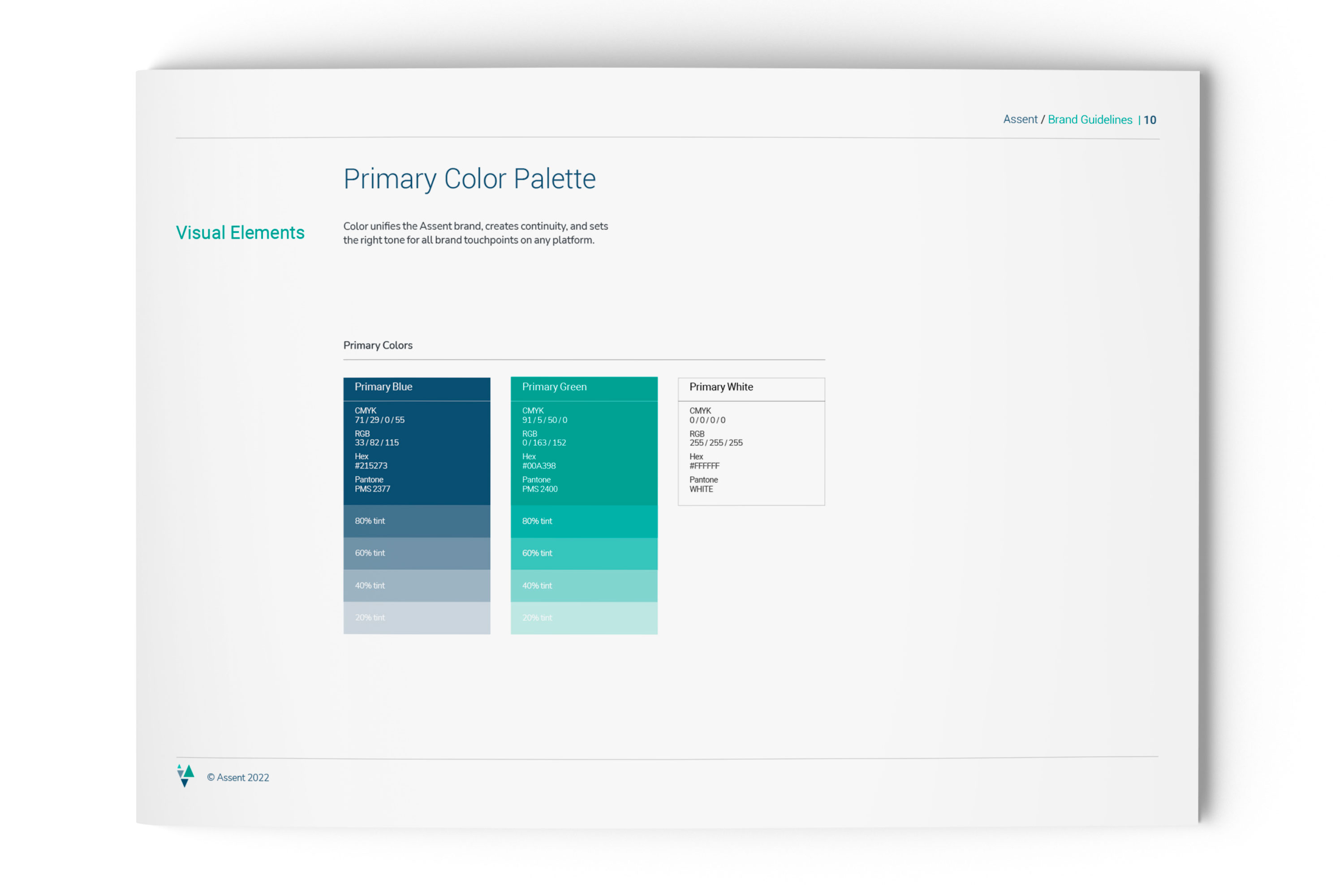
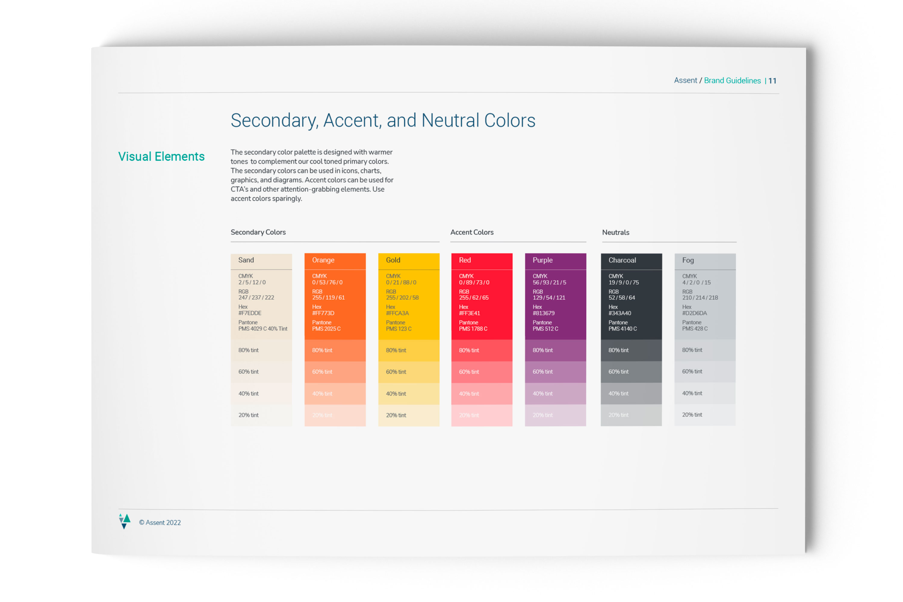
Cool blues and greens signal trust and renewal, with warmer secondaries for range of emotion and expression.

Photography for Business Impact and Social Outcomes

Customer outcomes are represented with macro photography themes of many parts becoming one, or a pattern that is continually repeated with ease and efficiency. Social themes also use patterns and repetition to evoke the organic growth and progress that occurs when an organization has sustainability driving its business plan. Human-focused photography accentuates positive outcomes to tough global/social problems in an ideal future state, imbuing the brand visual with forward-looking optimism. 

"Working with Skott as he translated brand strategy into brand design was a pleasure. He's a quick study, creative thinker and knows how to build consensus at all levels of the organization. He made a deeply important company look and feel like one in the marketplace."

Mike Cucka
Managing Partner, Brand Evident

Results

230% Lift

in social engagement after rebrand launch.

50% Growth

in first-touch pipeline.

Finally Looking The Part

The new brand gave a deeply important company a presence that matched its reputation